
Outcomes.com
Creating a visually informative and actionable home page
OVERVIEW
Outcomes.com is a web-based platform that allows doctors to easily manage, track and analyze patient reported data.
I led a team of seven product designers to recreate the home page for the platform through a Lean-based design process. Our process involved many steps starting with comprehensive user research to understand the needs of our users up until iterating upon our designs multiple times based on several rounds of validation studies.
SCOPE
- Our scope changed during the process of conducting usability testing and user research. Instead of focusing on redesigning the Patient List Dashboard and the Patient Treatment Page, we shifted our focus to create a home page that provided users with actionable data about their patients at a glance.
ROLE
As the design lead for this project, I:
- Delegated responsibilities for every team member and worked with them to meet our weekly goals
- Held daily meetings throughout the two month-duration of our project where we strategized, shared ideas, designed and conducted user research
- Maintained direct communications with our client and invited stakeholders into weekly meetings for progress updates and feedback.
THE CHALLENGE
The main challenge that my team and I faced with Outcomes.com is that we were working with a pre-market fit product that is targeted towards a very specific group of users who we were largely unfamiliar with.
GOAL
- To understand the needs of our users in order to create data that is useful for them
CONSTRAINTS
- Limited timeframe: 8 weeks
- Very specific user base with limited contacts to start
- Pre-market & pre-launch product- gave us no existing user data to work with
METHODS
- User research
- Job stories
- provisional persona creation
- test script, usability tests and user interviews
- Affinity maps & card sorting
- Designing
- Rapid ideation & wirefrmaing (via GV Design Sprint)
- Hi-fi mockup
- Clickable Prototype
- Validating designs through rounds of user testing

UNDERSTANDING THE PROBLEM
OUTCOMES.COM'S USERS
We wanted to gain an understanding of Outcome.com's users (their habits, behaviors, values), and how they are able to navigate through our existing UI.
We created a provisional persona to understand who our typical users are

Following the "Jobs-to-be-Done" framework, we came up with a number of Job Stories to understand different situational contexts that users might need to use Outcomes.com for and understand their motivations for doing so.
Our job stories helped us focus on the context, causality and motivations for Outcomes.com's users.
USER RESEARCH
We simultaneously conducted user interviews, usability testing and card sorting to guide us in making design decisions.
USER INTERVIEWS
Identifying our research goals helped us create open-ended questions to ask our target users for remote interviews, which yielded illuminating results that I will touch upon later.

Our research goals for user interviews
USABILITY TESTING (ON CURRENT UI)
We conducted usability testing on the current Outcomes.com platform with five different medical professionals to observe how they navigated through the website, and to see if any difficulties arose from their interactions with the interface. We gave users a few scenarios and tasks and recorded their interactions through join.me.

Observing how a user completes an assigned task
“I have no idea how to figure out how my patients are doing. How do you go back?”
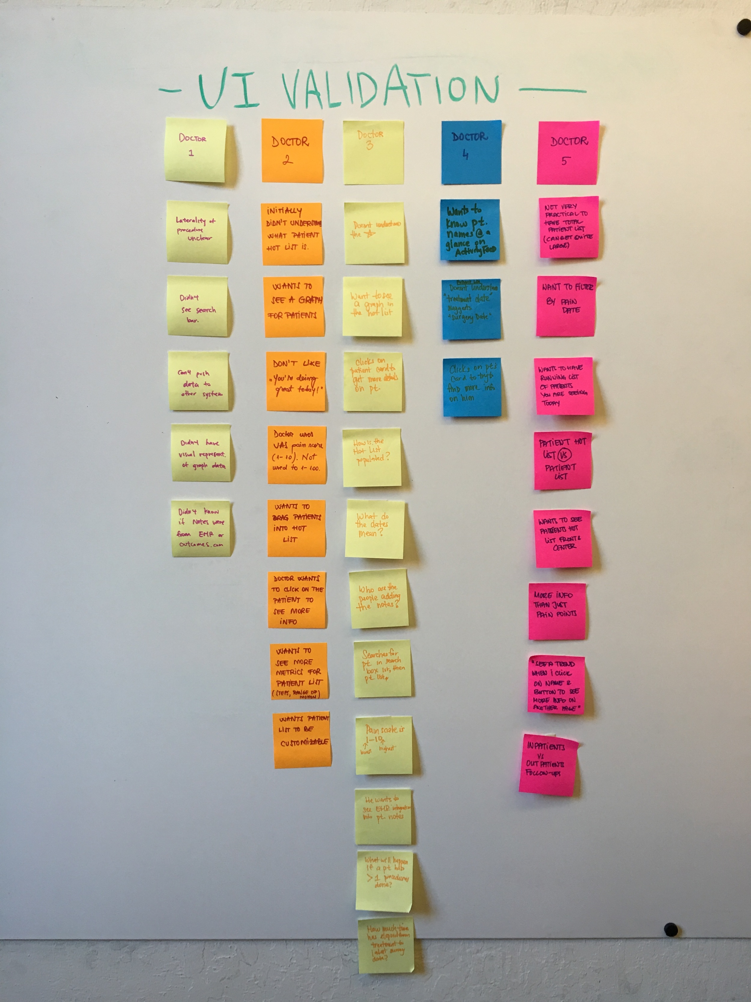
SYNTHESIS OF UI TEST
We synthesized our results by transferring each pain-point into a post-it note, and grouping them according to similar categories. Each doctor is represented by a differently colored dot on the top right corner of the post-it.
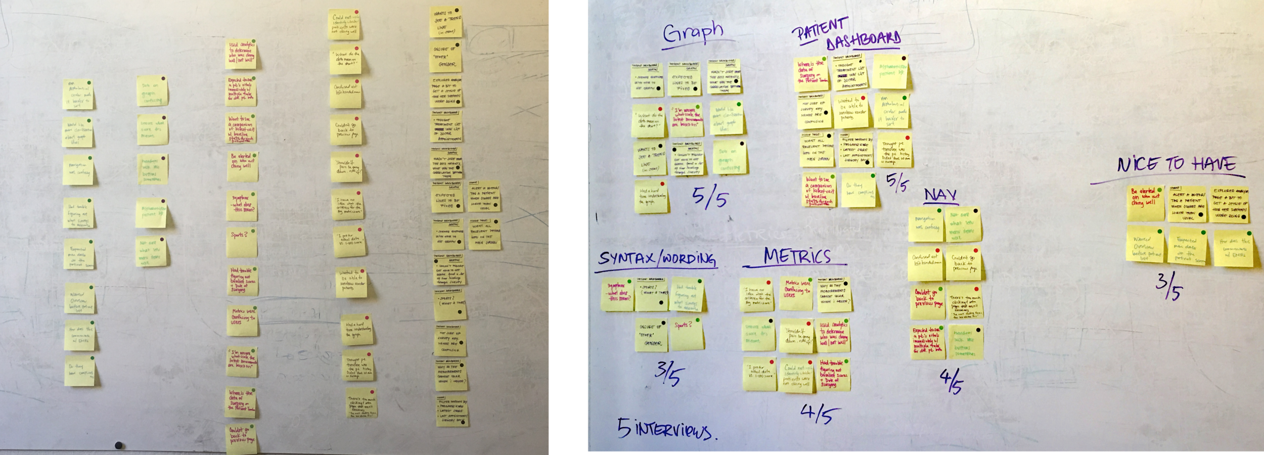
Number of Pain-Points Observed For Each Feature of the Current Outcomes.com
Observations:
- 5/5 users could not identify which patients were doing badly.
- 4/5 users had difficulties navigating back to the home page
- 5/5 users liked seeing a graph, but had difficulty understanding it
- 5/5 users wanted to have the capability to customize patient list
- 5/5 users did not understand the use of metrics and color
OPEN CARD SORTING
We deconstructed Outcomes.com into index cards for five different individuals to sort out, and categorize in groups that made the most sense to them. We sought to determine how users made sense of the various pieces of information on Outcomes.com to guide us in reorganizing the architecture and navigational menu.

STRATEGIZE
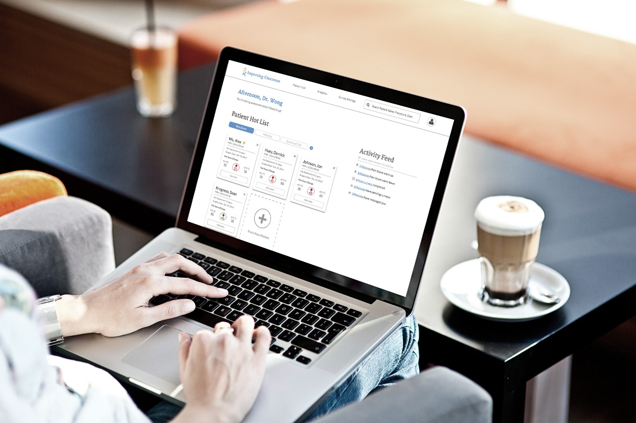
From our research, we saw that there was a clear need to effectively communicate relevant patient data to doctors at a glance.
We decided to address the various pain-points we uncovered by converging elements of the Patient Dashboard and the Patient Treatment Page into a home page that contained actionable and relevant information.
DESIGN

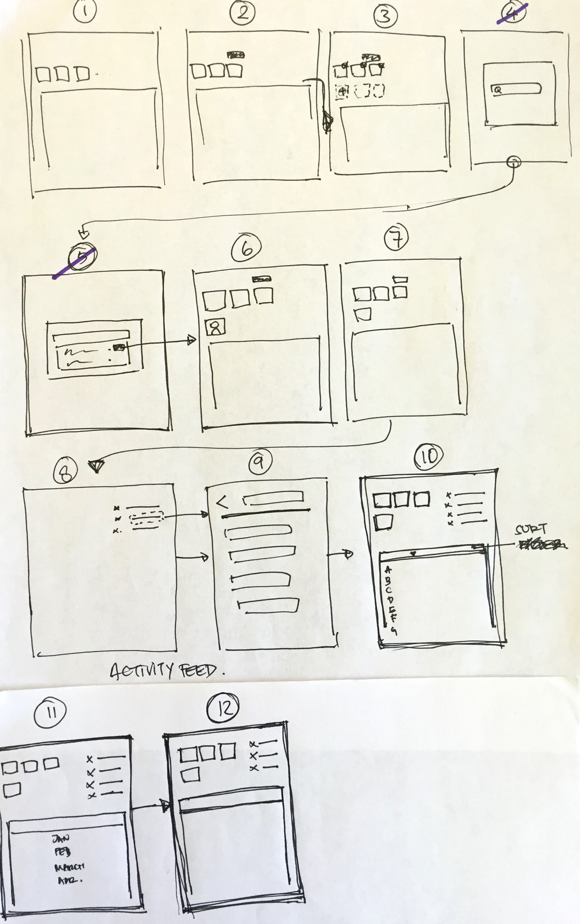
CREATING WIREFRAMES (DESIGN SPRINTS)
Armed with more knowledge about our users based on interviews and UI tests, we explored possible solutions through a multiple series of rapid wireframing via the Design Sprint Framework by Google Ventures.
Our clients were involved in this process, giving us an opportunity to educate them about our design process, and also allowed every person invested in the product to have his/her voice heard.


HYPOTHESIS-DRIVEN DESIGNS
Our ultimate goal for the home page redesign is to provide more value for doctors by creating actionable information at-a-glance.
Before sketching, we first formed several hypotheses to guide us towards creating informed user-centered solutions that address existing pain points in the app. We hypothesized that:
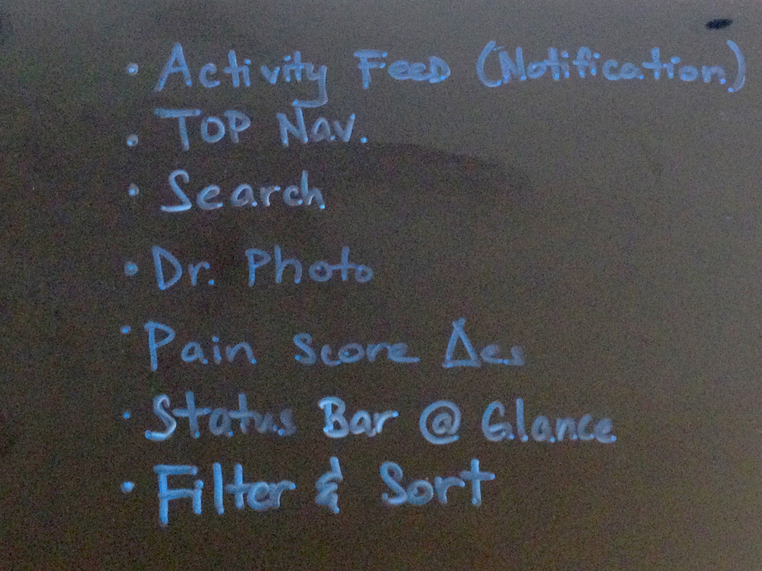
Features that we wanted to incorporate into our new designs
- The use and placement of patient cards on the home page will allow medical professionals to easily identify which patients are in need of the most attention
- Highlighting changes in metric score will greatly reduce the cognitive load on medical professionals by eliminating their need to browse through names on the patient list
- Adding a graph to display the trends in patient-reported pain scores will also aid doctors in identifying how their patients are doing.
STYLE GUIDE
I created a style guide for my team to use as we explored various elements in our high-fidelity screens. I incorporated elements from the current app, and added new assets that we used in our designs.

Select samples of a style guide I created
Using Sketch, we digitized our sketches into high-fidelity wireframes to explore various methods of presenting essential information in a digestible manner using color, copy and repeatedly validating our designs.
COMPREHENSION TESTING
One of the biggest challenges we faced during this phase was how to best design patient cards to efficiently communicate the changes in a certain metric (ie: pain scores). To aid us in this process, we conducted comprehension tests of our patient card variants on eight people to see if they understood the information presented in each card.
Observations:
- Users were unsure how to interpret the pain score changes unless they could refer it to a previous score
- Users interpreted red with an accompanied (+) or upwards arrow as a sign that the patient is not doing well, which was our desired interpretation
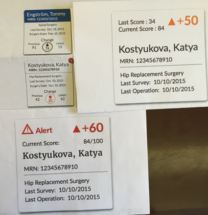
Comprehension Testing on Patient Card Variants

Final Patient Card
USER FLOW
We created a user flow to map out the user's journey in our new designs, to define tasks for users to perform for our validation studies and to understand how to structure our clickable prototype
PROTOTYPE VALIDATION
We validated our designs with five more medical practitioners to assess if our designs had addressed the pain points that arose from initial UI testing.

“I like the notes feature. I think in general, it’s a good tool to have. ”
“I like [the graph]. It shows me what I care about... that’s exactly what I want”

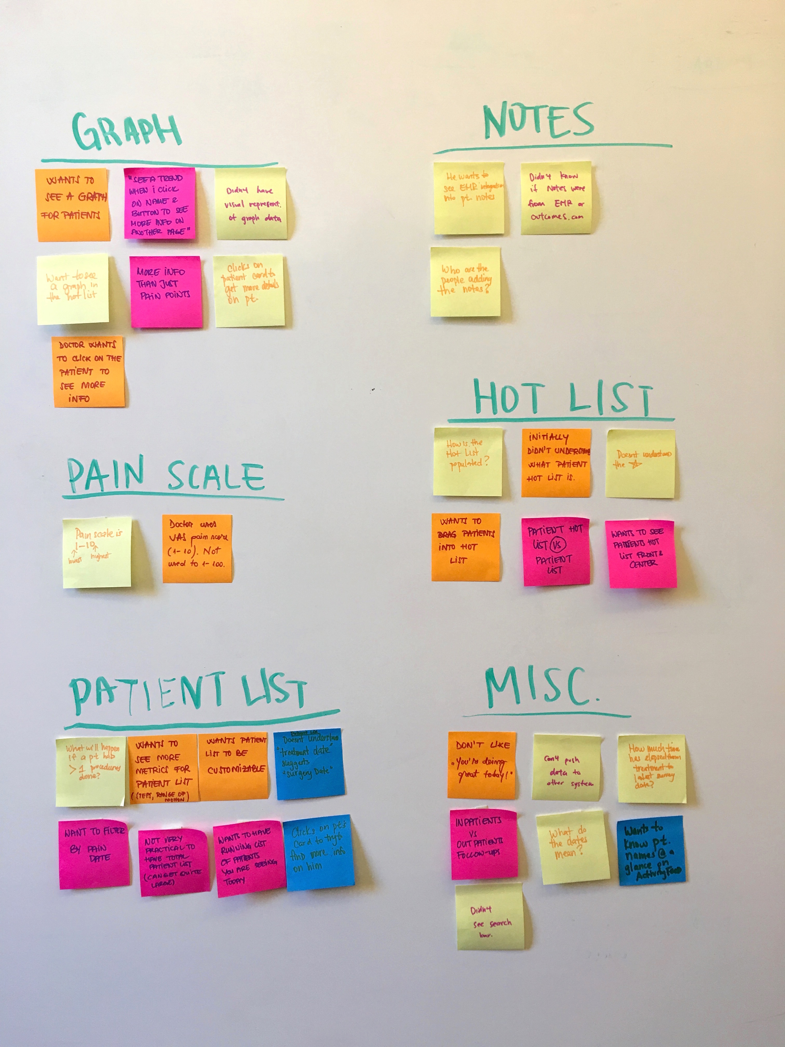
ANALYSIS & SYNTHESIS
We once again gathered all the pain points from our validation tests and grouped similar together.
Observations:
- There is a significant reduction in the number and variety of pain points from 49 (UI testing) to 35 (from our redesign validation tests).
- 5/5 users were all able to quickly identify which patients were not doing well
- 5/5 users found value in being able to see patient data quickly on the patient cards.
- 3/5 users found value in being able to get their "newsfeed" updates via the Activity Feed.
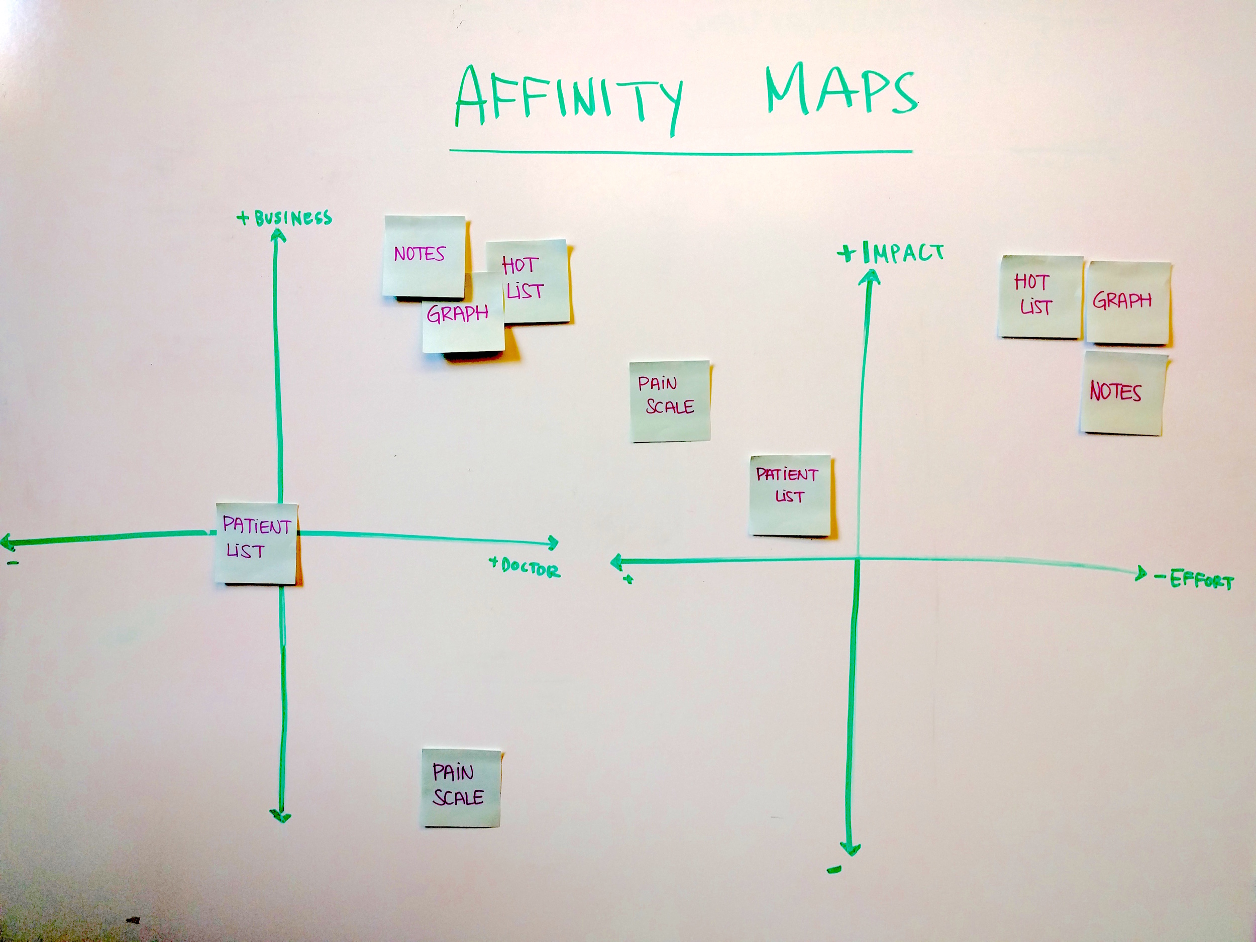
FINDINGS:
- 3/5 would like to see a graph showing a trend in data
- 3/5 users had trouble comprehending the hot list
- 4/5 users wanted more clarity and customizability for the patient list
- 2/5 users prefer using the 1-10 VAS* pain scale
- 2/5 users weren't sure who is responsible for adding notes.
*Visual Analog Scale for pain is displayed on a 1-10 metric vs. the 1-100 scale Outcomes.com uses.
We then plotted groups on two different affinity maps to determine which features were the most impactful, necessary and practical for us to iterate upon.
FINAL DESIGN RECOMMENDATIONS
We addressed these issues on our next iterations while also creating pixel-perfect high-fidelity screens for our final deliverable.


NEXT STEPS
Our client was pleased with our designs and is currently in the process of implementing them in time for pilot tests early next year. We urged our clients to continue gathering user feedback once the new designs are implemented, as there is only so much data one can gather from a clickable prototyping tool (ie: Marvel).

A very happy group of designers, and the rest of the Outcomes.com team
REFLECTION
Working on this client project really taught me a lot about design leadership, client communication and the healthcare landscape. Having a very specific user group taught me how to be a resourceful and resilient researcher to gather qualified people to interview and to conduct UI tests and validation tests. Through interacting with my client (a trained urologist), and various doctors, I developed a better understanding of the complexities and limitations of the healthcare industry.
Outcomes.com is a valuable patient-outcome tool that many doctors are currently taking interest in. Our client just got into the Berkeley Skydeck (an accelerator for disruptive startups) for his ideas! I believe that Outcomes.com will be a useful and efficient tool that many medical professionals will be keen on adopting especially when it is successfully integrated with EMR and patient scheduling technology.