

UVITE
A redesign of the mobile experience
OVERVIEW
uvite is a mobile app for easy event creation and invitation with unique settings that allow hosts to have more control over their events. I worked in a team of four product designers where we collectively worked on all aspects of the project, from user research to the final clickable hi-fi prototype.
SCOPE
- A complete redesign of the product from scratch into a new, edgy, fun and easily understandable product.
ROLE
- Primarily focused on event creation flow, home page redesign and the navigation.
- Worked with another product designer on the initial user research portion.
THE CHALLENGE
The challenge that my team and I faced with uvite is to create an app where its value features (limiting the number of attendees to an event, having a minimum number of attendees for an event to be viable, and a cut off registration time) were clearly understood and did not take away from users being able to easily use the app.
Goal
- To get users to easily use uvite and understand its value prop by addressing pain points from the app's existing UI, while highlighting its unique features
Method
- User research- screener, script, usability tests & synthesis of results
- Creating wireframes, and creating a high-fi clickable prototype through two rounds of iterations
Constraints:
- Limited time = 7 weeks.
- Pre-market fit product

UNDERSTAND
UVITE'S USERS
We performed competitor analyses on similar event planning apps to gain an understanding of the landscape, and to get a quick idea of the strengths and potential areas of improvement each competitor had that we can build upon for our uvite designs.
We found that there were no surprising findings with uvite's competitors.
We then created a provisional persona based on our client's idea of who his target users are.

Following the Google Ventures: Startup Lab, another product designer and I created a screener to screen for users most similar to Hannah Ingleson.
Usability Tests: 10 users
Duration: 1 day
Tasks: We gave the users a series of tasks to complete that involved various aspects of the app: onboarding, creating events, responding to events, messaging and using templates.

FINDINGS


Synthesis of our results illustrated a large number of pain points that were prevalent throughout the app-- most notably in the areas of: Onboarding and Event Creation (see graph) .
Total # of Pain Points Users Experienced for Each Facet of Uvite
General Observations:
- Many users did not seem to understand how uvite was different from any other app.
- We also had a number of users mention that the app had a very formal feel to it-- a far cry from what our client wanted
A breakdown of pain points users experienced from select features of the app.
Some facts:
- 10/10 users were put off by the onboarding process-- the nine-screen onboarding flow was not intuitive, hard to understand and unfriendly.
- 7/10 users weren't sure what to click first when they landed on the home page
- 10/10 users experienced problems understanding the event creation flow, becoming confused at various points throughout the process.
- 10/10 users were confused about how to complete tasks that required using the navigational features of the app (ie: creating templates, inviting friends, searching for groups).
STRATEGIZE
Knowing the limitations of the current design and the problems users faced in using the app, we took a step back and tried to come up with a game plan to address the various pain points that arose.
We decided to be ambitious and do a complete redesign of the app, based on the overwhelming number of pain points that we received an all aspects of uvite-- it proved difficult to just solve one aspect of the app, whilst neglecting the others.
HYPOTHESIS DRIVEN DESIGNS
Based on user research on the current UI of uvite, we came up with several hypotheses to aid us in our designs. We hypothesized that:
- Improving the onboarding experience will result in reduced friction amongst new users, resulting in more users downloading and creating new events through uvite. We plan to do this by:
- Reducing the number of screens from nine to two
- Allow users to continue going through the app without requiring email confirmation.

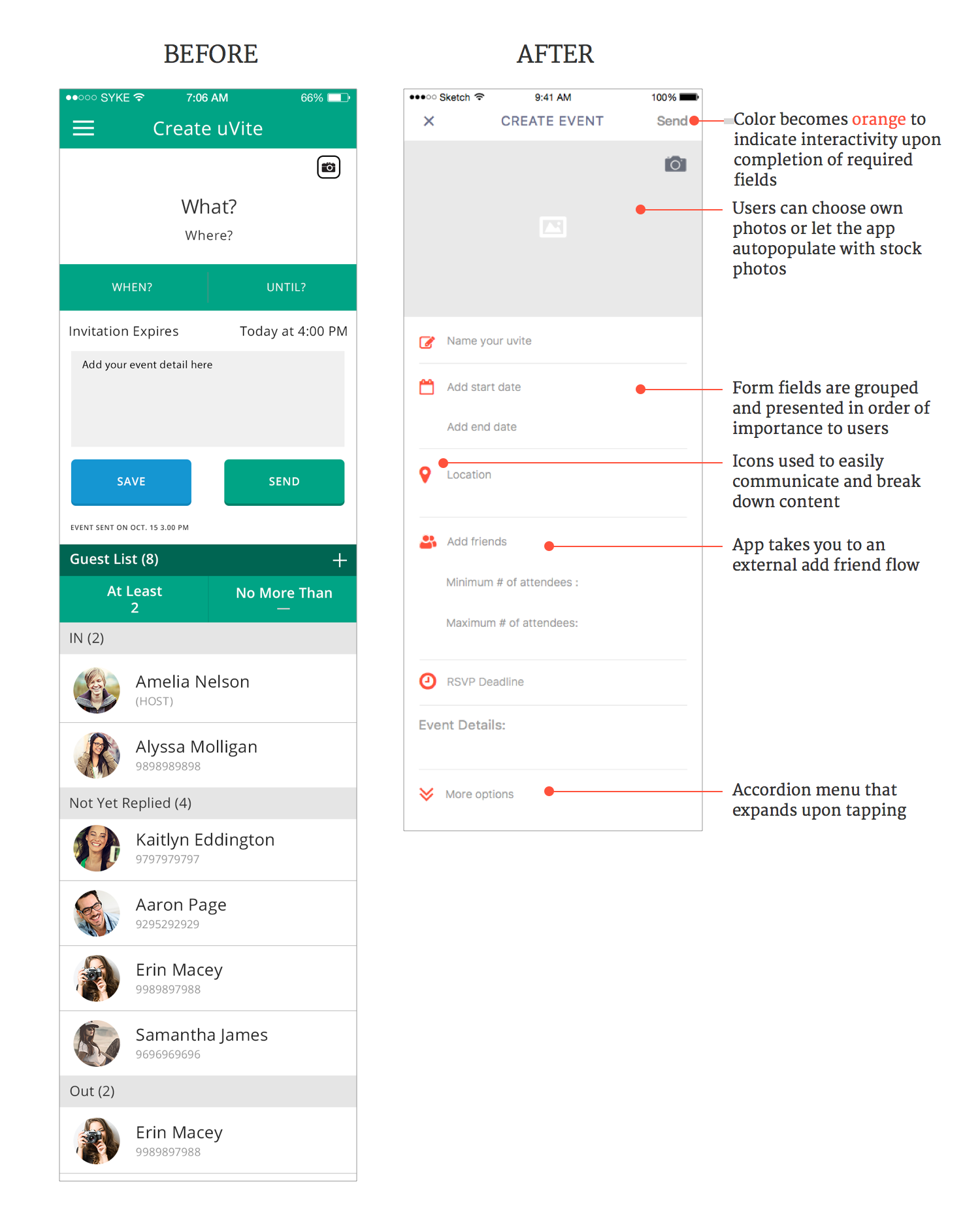
- Redesigning the event creation page where uvite's value features are prominently displayed will allow users to understand the value that uvite provides, resulting in a higher active user retention rate.
- Redesigning the home page to include coach marks instead of walking users through a nine-screen onboarding flow will allow new users to create a new event without confusion.
- Targeting a narrower group of users to individuals who hold and attend small athletic events/pick-up games by using more casual and fun design and copywriting, whilst highlighting uvite's value features will increase comprehension amongst users.
User Flow
DESIGN STORIES & USER FLOW
Before ideating on design solutions to address the various pain points uncovered during usability testing, we created several design stories and a user flow (keeping Hannah Ingleson in mind) in order to:
- create various scenarios in which users would need to use the app
- understand how users would use uvite
DESIGN

Design sprints are a very explorative and collaborative process
CREATING WIREFRAMES
Revisiting our user flow and persona, we began a series of sketches with pen & paper to address the pain points that my team uncovered in the usability tests. We each took on different aspects of the app and iterated upon each others' designs, allowing each member of the team to have his/her voice heard.
In this process, I explored the event creation flow, app navigation, and adding friends & groups to hosted events.
We then used Sketch to digitize our wireframes to get a more concrete idea on the basic visual aspects of the design. We played with proportions, alignment, placement and the copy.
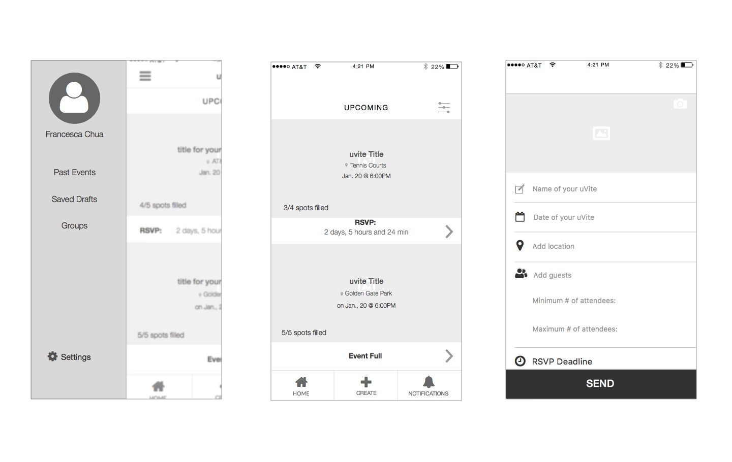
Select wireframes from left to right: Navigational Side-bar, Home Page, Create Event Form Flow
VALIDATING WIREFRAMES
Before proceeding to mock-up our digitized wireframes into high-fidelity designs, we first validated our designs on five users to determine if our work had indeed created a significant reduction in pain points.
- 5/5 users navigated through the onboarding process successfully
- 5/5 users found the create event page easily
- 5/5 users were able to distinguish amongst various event types (ie: events one is hosting, attending, and events one has yet to respond to)
- 4/5 users understood the value features of the app and saw value in it
““I like the minimum, maximum, that to me is huge!”

HIGH-FIDELITY WIREFRAMES
We then mocked up our wireframes to high-fidelity, iterating upon our designs to incorporate feedback obtained from usability tests on our wireframes.

STYLE GUIDE
As our client wanted to cater uvite towards younger and active crowds, we experimented with ways in which we could create something fun and edgy.
Color: We chose this shade of orange as the color evokes freshness, excitement and fun without being too overpowering.
Text Tone: We also tried to appeal to a younger crowd by using a more casual writing style, creating a more playful brand, and by adding an astro-dog.
Astro-Dog: To improve upon user feedback that the current onboarding flow was too long, imposing and confusing, my team and I instead opted to go for coach-marks so users can quickly learn on the go. We included a fresh-faced astro-dog into our welcome-screen with coach marks to guide new users into creating their first event.

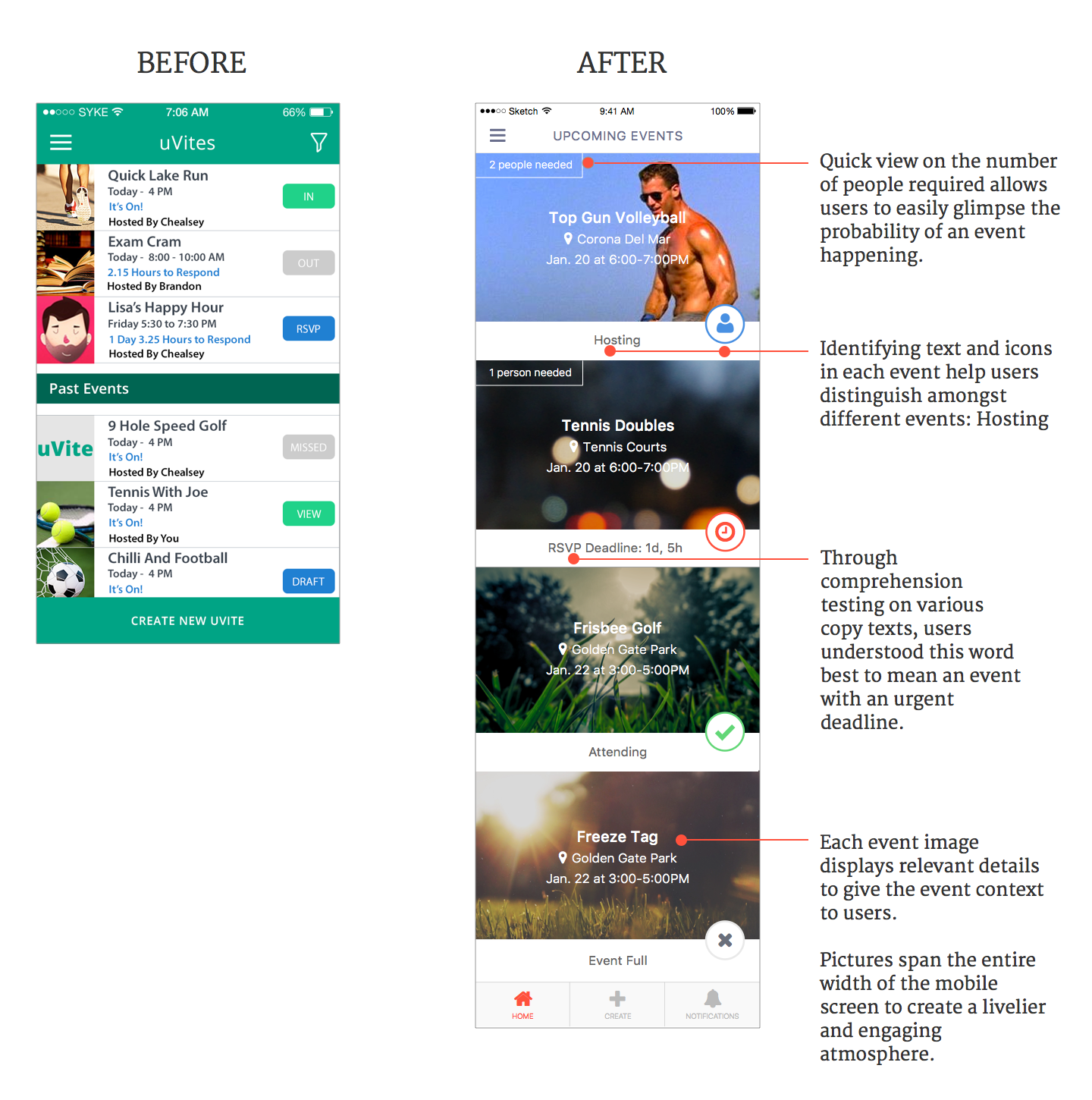
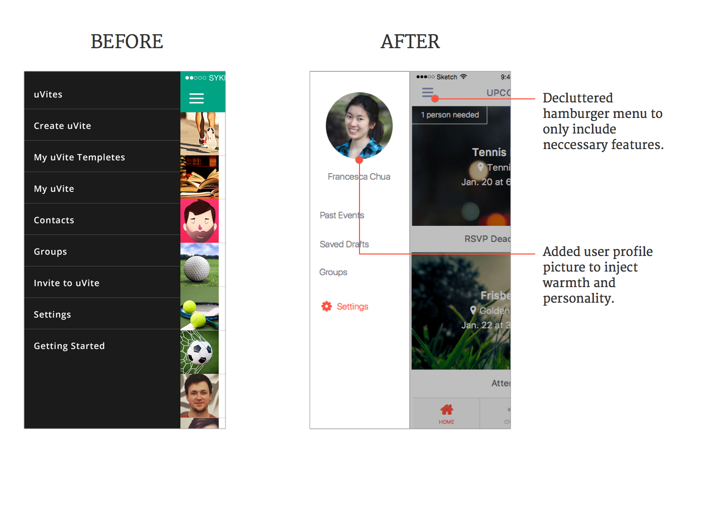
FINAL DESIGN SOLUTIONS (SELECTED)

CLICKABLE PROTOTYPE
NEXT STEPS
After creating a clickable prototype, we conducted another round of usability testing on five users. Upon synthesis, although some minor pain points still arose, we were tremendously excited to see our users being able to easily able to navigate through our prototype.
One user even commented,
“This is such a fun app, I would totally use this!”