
World Wildlife Fund for Nature
Reorganizing WWF's responsive website for mobile
Self-Driven Project. No affiliation with WWF.
OVERVIEW:
Having concise, and well-placed and easily accessible information is not an unusual challenge especially for websites with massive pieces of information. Such is true for WWF, whose website provides an incredible wealth of information to the public as it strives to create a connection between people and the natural world in a meaningful and engaging manner.
My Role:
- I worked alone on this project
- Deconstructed their website's IA
- Reorganized IA based on multiple card sorting tests
- Ideation
- Wireframing
- Prototype
- Iterations
Scope:
To create a responsive mobile design of the WWF's website, while improving upon the way information is organized to enhance a user's mobile experience.
THE CHALLENGE
WWF's website is a rich library of information that provides users with the resources to learn more about themselves and the natural world. However, as WWF's website continues to accumulate information, so does their need to find more effective ways of organizing and presenting content.
And so, in this self-driven project, I aim to learn how to take data from a website and reorganize the content in a way that is easily predictable and accessible for users.
Goals:
- To rebuild the structure of WWF’s responsive mobile website according to user needs and expectations.
- To place content where users expect to see it
- To optimize the website so that information is obvious to users.
Constraints:
- It was difficult to pinpoint who exactly the target user is because WWF appeals to a variety of target users. I have reached out to WWF's head office in Washington in attempts to understand their users. I have yet to hear a response from them.
Method:
- Open card-sorting to uncover the mental models users have with regards to how content is organized that will help inform my decisions in reorganizing the website's information.
- Use card-sorting results to aid me in reorganizing the structure of the layout via wireframe sketches, hi-fi prototypes and several iterations.
THE PROCESS

UNDERSTAND
OPEN CARD SORTING


I conducted card-sorting tests on 8 different individuals to observe how each person organized various pieces of information. I instructed my volunteers to group cards according to categories that made the most sense to them and to label each category.
FINDINGS
Below are diagrams showing the current content organization of WWF's website, and my recommended content organization based on the card-sorting tests.
Click to zoom in
BEFORE: The site map of the current WWF website showing all subcategories and the content within each page.
AFTER: Site map of my proposed version showing a shortened list of subcategories and content after multiple rounds of open card sorting.
DESIGN

Using the new site map I constructed with guidance from the card sort tests, I began the process of designing.
CREATING WIREFRAMES (Select)
I drew a number of sketches to re-organize WWF's mobile responsive website, incorporating user data I've obtained from open card sorting tests.

VALIDATING WIREFRAMES
I tested my wireframe sketches on seven users for comprehension to see if they understood the navigational components. Getting user-feedback was key to creating a product that was easy to navigate and understand.
Wireframe Iteration #1
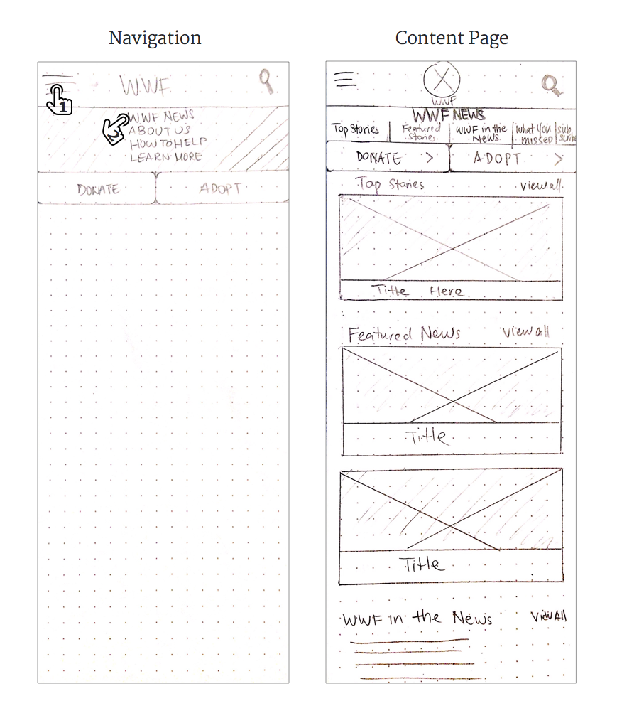
First Wireframe Iteration
5/5 users found the menu overwhelming and confusing. They did not expect to see the navigation buried in the hamburger menu
“It is unclear to me what the navigational elements are”
Wireframe Iteration #2

Users understood the navigation much better, but some (3/6 users) expressed confusion towards the different submenu sections, as a lot of them were very similar and left no room for potential future sections.
“I like how everything (menu items) are all on one page”
Wireframe Iteration #3

I played with the navigation bar further, removing the submenu to reduce cognitive load and to reallocate real estate for content instead.
4/5 users expressed preference over this menu over the 2nd iteration.
“I really like how [the] tab emphasizes where I am.”
SUMMARY OF FINDINGS (NAVIGATION)
Below is a summary of three iterations I've made on the navigational menu of WWF's home page.

HIGH-FIDELITY PROTOTYPE
I digitized my wireframes, mocking them up to high-fidelity prototype using Marvel.
As I created high-fidelity screens of my wireframes, I played with spacing, alignment and colors.

An overview of my high-fidelity screens
VALIDATION & ITERATIONS
I conducted another round of usability tests of my high-fidelity prototype on five users to:
- see if users were able to easily navigate through the app,
- uncover any pain points that remained
FINDINGS:
- 5/5 users were overwhelmed by the amount of information presented on every page
- 5/5 users found that the DONATE page left much to be desired

I was most surprised to hear a large number of pain points users found on the Donate page, given that WWF's largest source of funding (making up 32% of their 2015 funds) is from donations from individual contributors.
Below are comments from the Donate page alone.


“Wow... this is very confusing!”
“I don’t really know where to look at. There’s too many things going on here”
“I don’t like how it doesn’t explain what the gift is. I’m mostly turned off that the layout is so poor. It’s hard to process information so it makes me not want to give them money””
“The form fields are all clustered together and demand[s] more cognitive load”
“This page has a LOT of forms to be filled out”
Aside from the navigation, I also focused on exploring ways to reorganize content on the Donate page to enhance the appeal of donating while simultaneously minimizing the friction to do so.
FINAL DESIGN RECOMMENDATIONS (SELECTED)
Here are before and after design recommendations for selected screens.

Before & After: Donation Page
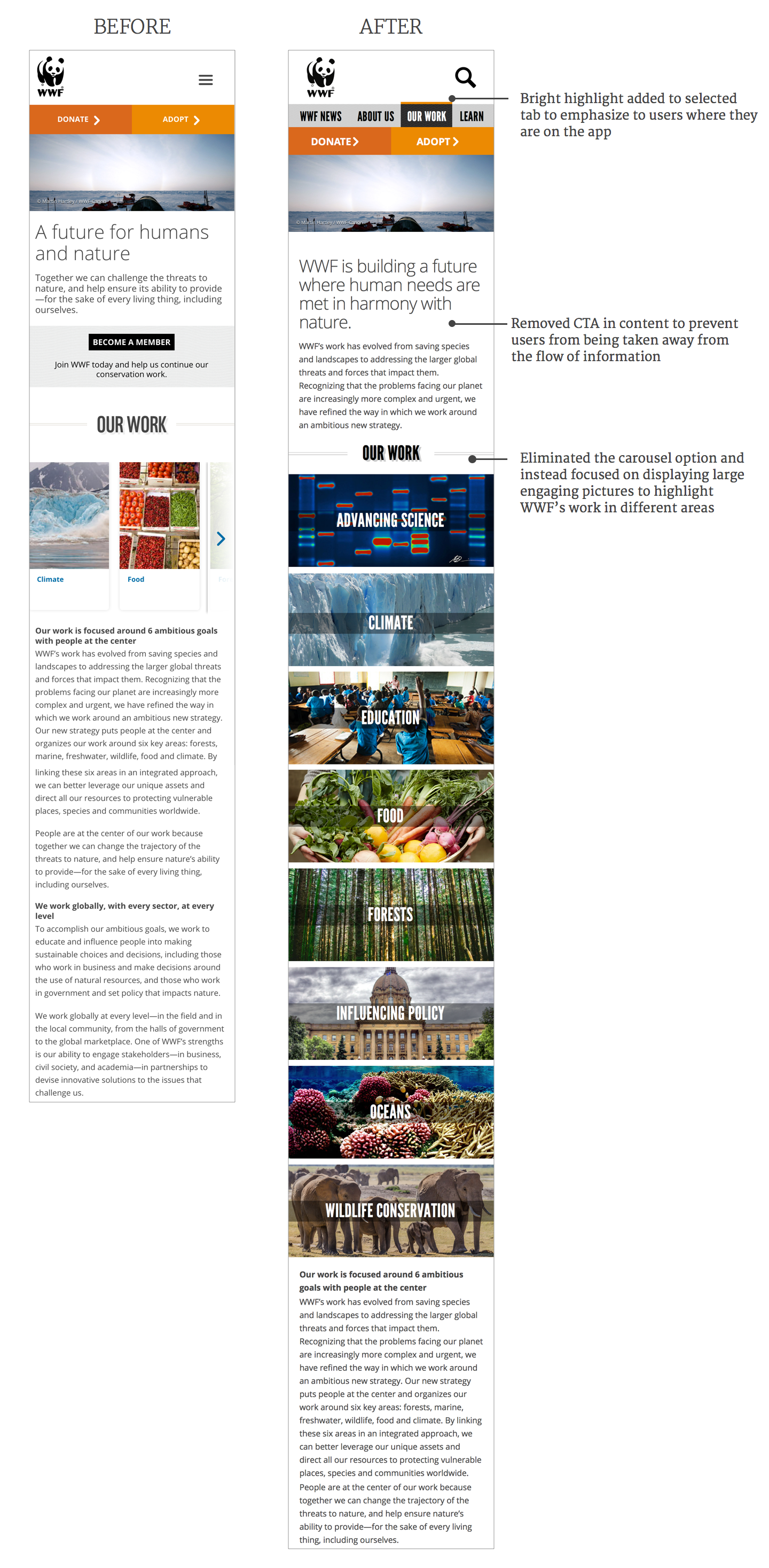
Before & After: A snippet of WWF's OUR WORK page
CLICKABLE PROTOTYPE
REFLECTIONS
I chose to create a responsive mobile website for WWF because their mission to provoke a change in our perception and behavior towards our planet is crucial for the well-being and sustainability of our future. I wanted to create a way to make WWF's content easily accessible for users on mobile by creating a navigational system that can accommodate for WWF's expanding library of information.
Conducting card sort tests was a very crucial tool that helped me understand the mental maps people have towards various data.
NEXT STEPS
There are a number of steps that I would like to tackle moving forward with this project. I would:
- explore how I could create a consistent style across the different pages and elements in WWF's site.
- conduct more usability tests to identify how to best organize and display content in the app, incorporate user feedback and iterate further upon my designs.